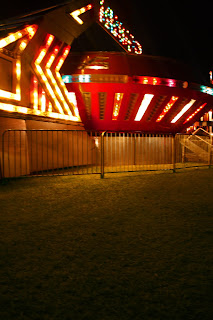
 The picture to the right has the beastly ride, The Gravitron. It spins so fast that the people on the inside get pulled back to the walls! It always makes it difficult for me to walk afterward. The editing that I did in this photo include the grass color and the color of the lights themselves. I used Photoshop Element to add a tinge of green to the ground and to make those lights stand out that much more.
On the photo below, I mostly edited the contrast, but only a little. I also used a theme from Picnik that makes the center look more colorful than the outer edges of the picture.  I wanted that ball of light to shine just a little more:)

This "Bottles" game caught my attention. The basket of rings was in the perfect line-up with the bottles, so I decided it was photo material! It turned out just how I hoped. The only editing I did with this photo was adding a hint of extra saturation as well as a slight contrast adjustment.
I like the Gravitron. It could be sharper but it works in the small size.
ReplyDeleteBottles is nice too. Especially the out of focus.
I like the bottles. It tells the story of the futility of winning that game.
ReplyDeleteI'm with the others, too. I love that last shot. I love all the circles in it--the rings, the basket, the ring mark on the shelf...I love that you made lines out of circles, too, with the rows of mouths of the bottles.
ReplyDeleteI love love love that one of the ring game!
ReplyDelete